This is the opening shot of my film trailer. It establishes the film taking place ina fairly urban, built up enviroment. This shot was taken from my window which has a view of packed together houses, back yards and various vehichles. I felt it made an acceptable opening for my trailer. To film this I had to use a camera without a tripod as getting into position with a tripod was impossible. To make sure the shot was as not shakey as possible I slowed it down so that shake was less noticable and held the camera as still as possible.
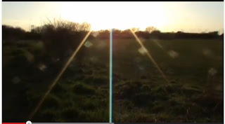
The second shot was of the camera panning up at the sun over a field. The shot coincides with a relevant line in the trailer which is why I included the shot. It could also be taken metaphorically with the sun rising at the beginning which says the sun rise is the start of the story. To get this shot I originally panned down from the sun then changed my mind on what I wanted afterwards and chose to reverse the footage and slow it down so it went into it. I felt this made the line more relevant.
These two shots are teaser content for what will happen in the rest of the film showing a murder and a bloody knife in a sink. It has an audience asking who and how and is a way to grip them and make them want to see more. To get the blood on the hands I mixed various different colours of paint until I got the colour I felt best represented blood then watered it down and spread it over my hands and a knife. I then had someone else film it from a top down angle.
This is a second establishing shot showing where other action in the movie will take place.I pan down into it to suggest we are literally being 'dropped into' the story. I introduce the characters of the movie here.
The next couple of shots are MCU's of some of the main characters who are being introduced into the film. This would generally attract an audience for seeing who is in the film if they recognized them but also show them who the story will be focused on. I chose MCU shots because it focused on the character whilst still showing they are in the area of the previous establishing shot.
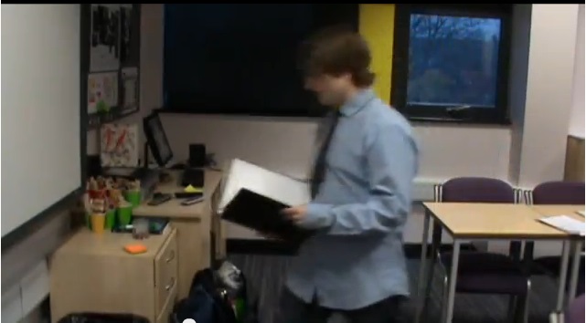
This shot is the involved characters entering an office for a scene and one of the longer sections of the trailer. It begins introducing the characters a little but not completely opening them up.
This shot shows the villain of the movie pacing contemplating recent events. It begins to hint at his true nature which is further suggested in the following scene. To do the pacing scene I had to slow down the footage as the original was to fast. I also made this scene in credibly short so some people may miss his intentions at first and see it as any other shot.
This is the following shot which further confirms the main villains plans and introduces his accomplice in the movie. It shows them having a suspicious conversation in shot reverse shot asking evidence to be destroyed.
The following scenes are a sort of research montage and as such have imagery likely associated with an office. I filmed me typing and chose a segment which looked most natural. The lighting I feel emphasizes that the character has been at what he has doing for a long time.
This shot had the previous computer screen in the background to suggest the stuff in front is what is being researched. I followed this up by putting in close ups of key words which link with the case. To create this shot I lowered the opacity of the research shots and put them over the computer screen.
The same thing was done with these shots with different imagery being used as I included a glass of alcohol being poured in the background possibly showing the stress of the case getting to the character.
This is a shot of a phone receiving a message with information relating to a case. I simply asked someone to send me a message while renaming their name in my phone. I also attempted zooming for dramatic effect.
This shows a reaction to the text of one of the characters revealing a gun at their side. It is a revolver, a small gun often used by the police or detectives and is easy to acquire. The shot I feel is suitable as a reaction showing the build up of suspicion in the case.
These shots involve a confrontation between two of the characters. It shows how tensions will build in the film nearing on violence. To achieve this shot I moved the camera from various positions to get different angles of the build up to and the confrontation itself. By doing this I have made it look as smooth as possible.
This part of the film trailer speeds up and contains the most action. It shows the two villains, almost arrogantly walking around a corner and then a chase scene between two of the other characters down a previously shown location. It also shows the chaos which has ensued due to the case possibly making an audience want to know more about it.
The chase was done looking in two different directions down the street which could make it seem longer than it actually is without dragging the trailer down with its length.
They're two review shots like this in the trailer in bold white writing which are used in most trailers to give more incentive to see the film.
This shot was done in a phone box and was me trying to recreate elements you might see. This shot also possibly introduces an anonymous character, a further way to grip an audience.
This shot is a close up on a gun barrel and is the final shot of the trailer. It makes the audience ask who, if anyone, will be shot. I tried to put as many questions in as possible that will make the audience want more.